How to be more Napoleonic when using data visualisation
Data visualisation done well can be a beautiful thing - but it can be easy to get wrong. alan. Art Director Joanna Bird reveals the good, the bad and the ugly.

Bad data visualisation, I hate to say it, is everywhere. You’d think that the sheer volume of numbers processed on a daily basis by the media over the past year - updating us on everything from deaths to jobs lost throughout the pandemic - would mean that data visualisation expertise would have stepped up a notch. But that just hasn’t been the case.
Using the wrong format, without the right context, can not only confuse readers, but worse, mislead them. Consider these bad examples of Covid-19 data visualisations as a case in point. Misleading people by skewing or misrepresenting data puts a knife in the heart of researchers everywhere.
And it’s not just the overwhelming information that the pandemic has thrown at us that’s to blame. Tweaking a data visualisation to tell the story you want to tell, versus the one the data is actually telling, has long been a trick of dodgy content creators.
How’s this for an example? When the US state of Florida enacted its personal self defence law in 2005, the gun death rate jumped. But a simple line graph accompanying many news reports seemed to represent gun deaths actually dropping. The problem? The designer had flipped the Y axis so its values went low to high rather than the convention of high to low (see this article for an explanation).
What does good data visualisation look like?
It’s a shame, because data visualisation done well, as a storytelling vehicle, can be a beautiful thing - especially in this current era of continuous scrolling, shorter attention spans and increased competition for eyeballs. From infographics to tables, charts and graphs, data visualisation can really help people engage in and understand something. Data can be your ‘TL;DR’ summary guide, that can be more easily shareable too.
Perhaps the most famous example of this is how Napoleon’s Russian campaign of 1812 has been depicted. In a single view, you can follow just how many soldiers advanced and retreated across a certain distance and in what conditions. It’s nothing short of genius and continues to be used at the start of many data visualisation lectures.
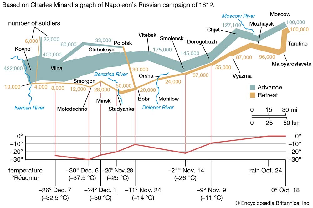
Napoleon's Russian campaign of 1812. Source: Encyclopaedia Brittanica
I’m also a big fan of The Guardian’s long scroll data journalism, which helped tell lots of different, but true stories about the pandemic. Its leading data journalists talk more about it here. And if you love data and design like I do, you can’t go past Information is Beautiful. The website is brilliant, but the coffee table books of graphics portraying everything, from types of facial hair to which fish are good to eat, are simply a joy to peruse.
What to consider when designing data visualisations
So how can you be more Napoleon when it comes to data visualisation - being responsible, informative and creative? Having an idea of your primary audience is really important. Is it someone that understands complex concepts, like changes in the real estate market? Or are you trying to explain a particular trend to an everyday person?
As with all design, empathy is the way forward. If you take yourself out of it, and think, ‘what if I was looking at this for the very first time’, what conclusion would you draw? That's important too, as is being clear on the story you want to tell.
Simplicity is definitely your friend. So think about what's going to be important for the reader to be looking for. And make sure you're using the correct kind of visualisation device for the type of data you have, because when we visualise something, it can completely change the way it’s read - like our gun crime example.
You have to take care to do the data justice, while thinking about the narrative journey you want to take people on. For example, if you wanted to show change over time, you’d probably want to avoid a bar chart and go for a line chart.
Infographics work well when the key message is clear, and there are strong, straightforward statistics you can use. You can even use several in a scrolling series.
Which platform will the data visualisation appear on?
Either way, don’t fall into the trap of thinking that one piece of data visualisation is going to do the job for everything. Strategically, you could have one hero piece of content that you break down for different formats to get as much value out of that content as you possibly can.
For example, a long scroll might work on your blog, but it won’t have the same effect on Twitter or Instagram. It will need a rethink, perhaps into a simple animation.
Ideally you're wanting to take as much of the work out of reading for the audience as you possibly can. It should never make a concept look more complex than it is, or more difficult to grasp. Think: be less Florida. Be more Napoleon.
Want to find out more about data visualisation? Call us on 020 3877 3800 or email us at contact@alan-agency.com to speak to one of our specialists.